Competitive Analysis
During our competitive analysis, we saw that there are multiple health providing apps that do a few things
really well, but lack some of the core functionality that our personas (ideal users) need. For our
analysis we looked at apps like Zodoc, Doctor on Demand, Amwell, and Kaiser Permanente. After looking
at competitors, we decided that we wanted a design that included an easy appointment scheduling system,
the ability for users to both video chat and message chat with a doctor from wherever they may be,
easier access to users' Medical Records, the ability to check the current live wait time, an easy
check-in process for appointments, and push notifications to update users on their prescriptions
and or lab results.
User Interview Findings
During our competitive analysis, we saw that there are multiple health providing apps that do a few things
really well, but lack some of the core functionality that our personas (ideal users) need. For our
analysis we looked at apps like Zodoc, Doctor on Demand, Amwell, and Kaiser Permanente. After looking
at competitors, we decided that we wanted a design that included an easy appointment scheduling system,
the ability for users to both video chat and message chat with a doctor from wherever they may be,
easier access to users' medical records, the ability to check the current live wait time, an easy
check-in process for appointments, and push notifications to update users on their prescriptions
and or lab results.
Personas
We created personas based off of the feedback we received from our user interviews. The two personas
we created represent ideal users of our app who visit the Health Center but have busy schedules,
don't want to repeat the same information to multiple people, and to schedule appointments quickly.
Ashely’s Scenario
One Monday morning, Ashley woke up with a sore throat and a high fever. She has work at 1pm, so she wants
to try to schedule an appointment with the Health Center before her shift. She checks the current
wait time by checking on the app and sees that the wait time is 30 minutes for an appointment. She
opens the app, schedules an appointment for 11:00am with her primary doctor, Mrs. Johnson, and fills
out a form to describe her symptoms. Once she gets to the Health Center, she checks-in through the
app and waits for her name to be called. After her appointment has concluded, Mrs. Johnson prescribes
her medicine for her sore throat and fever, directing her to the pharmacy to get more details about
when to pick up her medicine. The pharmacist lets Ashley know that her medicine will be available
in one to two hours and that she will receive a notification from the app confirming when her medicine
is ready to be picked up. Ashley leaves the Health Center, goes to her shift, and at 1:30pm receives
a notification from the app that her medicine is ready for pick up. After her shift is over, she
goes back to the Health Center and heads to the pharmacy to pick up her medicine.
User Flow
We developed user flow diagrams to determine the easiest and fastest way for users to accomplish tasks.
Featured prioritization
We created featured prioritization matrices to determine our main priorities of the app.
Wireframe Sketches
The first step of the design was to create wireframe sketches on paper.
Low-fidelity prototype
We used Figma to create the interactive prototype because Figma allowed us to collaborate.
Click here to see the interactive low-fidelity prototype.
Low-fidelity User Testing
We tested our lo-fi prototype with three people to measure the usability of our core features by asking
them to complete four tasks one-by-one while they talked us through their thought process as they
interacted with our design.
Mood Boards
We decided to chose greenish and bluish colors because blue represents trust, so we wanted the users to trust our app and we also chose green because it represents health, and of course this is a health app.
High-fidelity prototype
We used Figma to create the interactive prototype because Figma allowed us to collaborate.
Click here to see interactive low-fidelity prototype.
High-fidelity User Testing
After collaborating on the hi-fi design of our app, we asked 8 users (2 pilot testers) to fill out a
demographic survey, interact with our design and attempt to complete three tasks one-by-one while
they talked us through their thought process, fill out a SUS survey, and a final post-test survey.
Metrics being measured: task completion rate, time to complete tasks (in seconds), SUS score, and
error analysis.
Tasks Completion
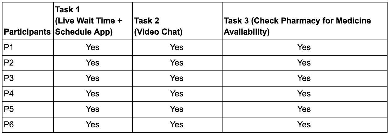
Six participants were tested with three tasks. Each individual was able to complete the tasks.
Time To Complete Tasks
The first task took the longest to completed as expected.
Error Analysis
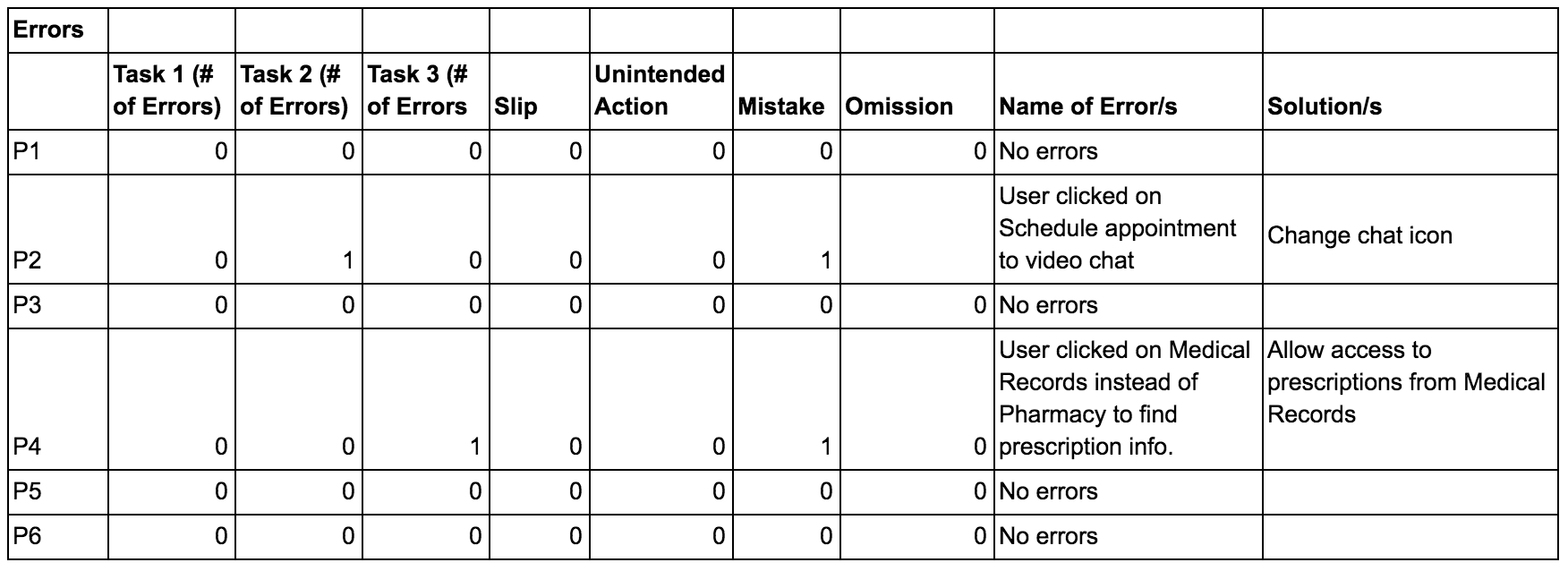
A total of one task error were made and two mistakes.
Demographic Information
All of the users had attended the health center at least once a year. Many of them complained about how long they had to wait at the medical office before being called.